
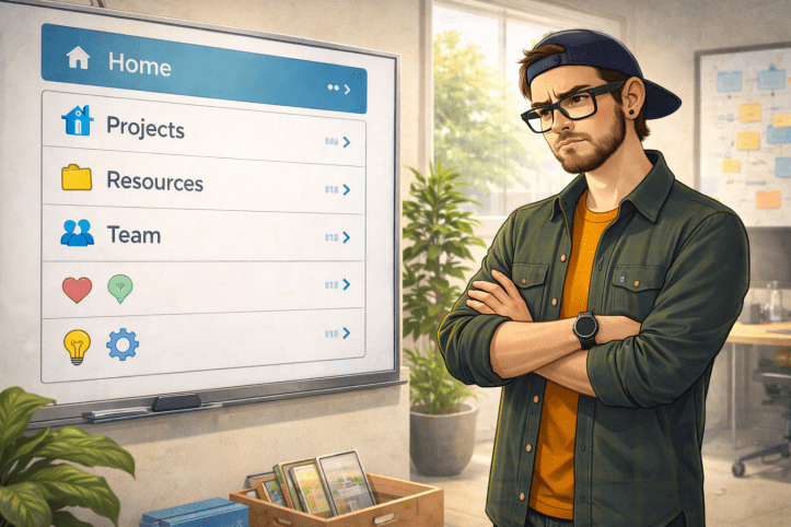
Navigation is one of those things everyone has an opinion about and very few people want to own.
Over time, it turns into a dumping ground. Every site needs a link. Every team wants visibility. Every stakeholder is convinced their content is critical. The end result is a navigation menu that tries to explain the entire tenant.
That is the problem.
Navigation is not a sitemap. A sitemap documents structure. Navigation should support tasks.
When navigation mirrors site structure, it makes sense to administrators. It almost never makes sense to users. Microsoft’s guidance on information architecture models and examples reinforces this distinction by focusing on user goals rather than technical hierarchy.
Early versions of SharePoint trained us into the wrong habit. Subsites everywhere. Hierarchies nested five levels deep. Navigation that auto-generated itself from structure. If you created it, it showed up.
That thinking stuck around long after the platform moved on.
Modern SharePoint changed the model. Flat architecture replaced deep hierarchies. Hub sites made it possible to connect related sites without forcing them into a parent-child relationship. Navigation became intentional instead of automatic.
Hub sites are one of the most underused improvements in modern SharePoint. They allow content to live where it makes sense while keeping navigation focused on what users actually need. This shift is reflected in Microsoft’s guidance on planning navigation for the modern experience, which emphasizes association over nesting.
Overbuilt navigation usually fails in predictable ways.
Everything is labeled “Resources.” Menus grow horizontally and vertically. Important links get buried under well-meaning groupings. Usage drops, and search becomes the escape hatch.
When users rely on search to avoid navigation, they are not being lazy. They are telling you the menu is doing too much. Microsoft calls this out indirectly in its guidance on planning and implementing navigation design, where clarity and prioritization matter more than completeness.
Navigation should answer one question, what am I trying to do right now?
Search helps you find something you know exists. Navigation helps you discover what you didn’t know you needed. Mixing those responsibilities is how both fail.
One small but surprisingly effective improvement in recent years has been emoji support in navigation. Used sparingly, icons help users scan menus faster and distinguish sections without reading every label. They reduce cognitive load, especially in hub or global navigation where lists can otherwise blur together. Like everything else in navigation, emojis clarify intent when used with discipline and quickly become noise when used as decoration.
Global navigation and the footer are also often overlooked. Global navigation is powerful when it surfaces truly cross-organizational tasks rather than acting as another sitemap. The footer is ideal for secondary links, compliance content, or rarely used resources that do not belong in the main menu.
Audience targeting can help reduce noise, but it does not fix bad design. Showing fewer links to fewer people only works when the underlying structure makes sense. Targeted confusion is still confusion.
Navigation also needs ownership. Not just at launch, but over time. Links decay. Projects end. Content moves. Navigation rarely gets pruned. Stale links erode trust faster than missing links because they teach users that clicking is risky.
Working in international organizations taught me another lesson quickly. Navigation is not universal. Language matters. Multilingual navigation is not optional when teams span regions and cultures. SharePoint supports this when you intentionally design for it, as described in Microsoft’s guidance on creating multilingual SharePoint sites, pages, and news.
There is another pattern I have seen more times than I can count. Someone asks me to upload a Word document to SharePoint so others can read it. They want the document to be the page.
Explaining that Pages exist, that they are easier to read, easier to update, and easier to navigate to, has always been a struggle. People understand files. Pages feel abstract. But the moment content becomes navigational, Pages win every time.
Navigation decisions are governance decisions, whether we admit it or not. Who can add links. Who approves changes. How often navigation is reviewed. These choices shape how people experience SharePoint far more than most policies ever will.
Good navigation feels boring. It fades into the background. Users do not notice it because it works.
Bad navigation becomes the product. Users talk about it. Work around it. Avoid it.
If your navigation needs a legend, it is already too late.
Navigation is not there to explain your SharePoint structure. It is there to help people get work done without thinking about SharePoint at all.
That is the bar.

This post is part of my 25 days of SharePoint series, created to celebrate SharePoint’s 25th anniversary and lead up to the SharePoint at 25 digital event on March 2.
Each post reflects on what actually made SharePoint last 25 years, the wins, the mistakes, and the lessons learned from building, breaking, and rebuilding it in real organizations.
You can find all posts in this series here.
If there’s a topic you think I should cover next, a SharePoint mistake you keep seeing, or a question no one ever answers straight, leave a comment. This series is shaped by real experiences, not marketing slides.

[…] specific problems well. Navigation should guide action, not mirror the org chart. The lesson behind task-driven navigation and clarity over web part overload becomes obvious only after living through […]
LikeLike