
TL;DR: I asked Copilot to drop me into a grimy backstage selfie with four icons from the 80s. The result was more than a cool poster. It proved that clarity beats cleverness in prompts, intentional constraints boost creativity, and tools only look smart when you get specific. Backstages can be messy, just like your M365 tenant, so plan for the mess and make it part of the vibe.
The setup: why this, and why now?
Nostalgia has muscle memory. The 80s were not only shoulder pads. They were strong choices. Big sound. Bold silhouettes. Iconic textures. That energy is exactly what most of us miss when we prompt AI. We mumble and hope for magic. The model delivers a shrug.
So I gave the machine a scene with a spine:
- Place: a dim little room, backstage at a grimy concert hall
- People: me plus four titans, exactly as they looked in the 80s
- Lens: high-angle selfie, intimate, chaotic, real
- Format: 9:16 vertical, because this belongs on a phone, not a gallery wall
- Light: realistic cinematic, not plastic skin, not a wax museum
- Tone: laid back, real swagger without the pose
The more I committed, the more the output committed back.
The prompt (copy and paste ready)
First off, get a decent looking photo of yourself. Photos without a background are typically better. Then upload it to Copilot and enter the prompt below:
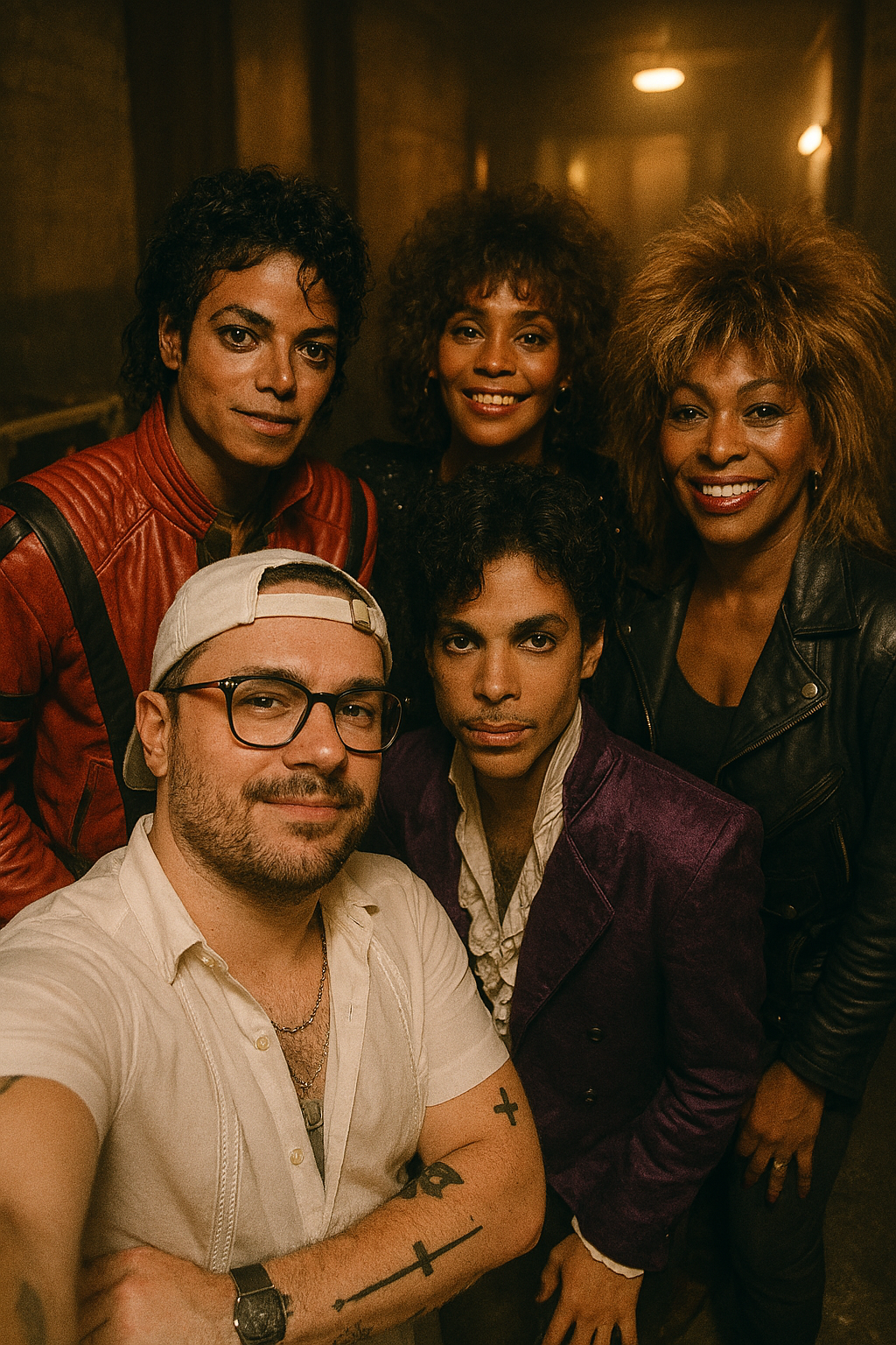
Create a super realistic 9:16 vertical (portrait) selfie featuring me (match the attached photo reference) with Michael Jackson, Prince, Whitney Houston, and Tina Turner. Style all four exactly as in the 1980s (hair, wardrobe, makeup, era-correct textures). Scene: cramped, grimy backstage room after a concert—scuffed floors, road cases, soft practicals, ambient haze. Camera: high-angle selfie, arm’s-length, slight lens distortion. Lighting: realistic cinematic; motivated by a single warm bulb and spill from a hallway, rich contrast without crushed blacks, clean skin texture (no plastic look). Mood: laid-back, we look effortlessly cool. Composition: subjects naturally clustered, shoulders overlapping, believable depth and occlusion. Finish: photo-realistic 3D aesthetic, grain matched to ISO 1600 film, subtle chromatic aberration, era-accurate color palette.Notes:
- I specified lighting sources, for example, a single warm bulb and spill from the hallway. That is better than saying “moody lighting.”
- I asked for grain and chromatic aberration. Small artifacts carry a lot of truth.
- “Era-accurate color palette” stops modern teal and orange from taking over.
Add your face reference and you are ready, so behold the final result:
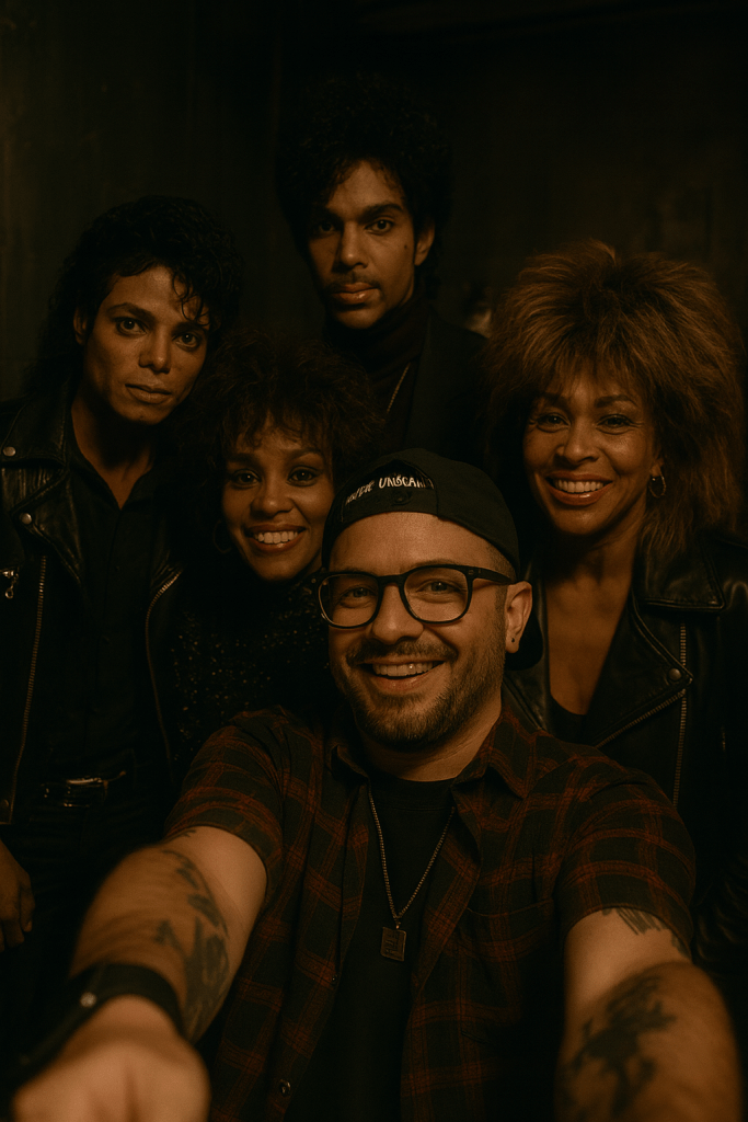
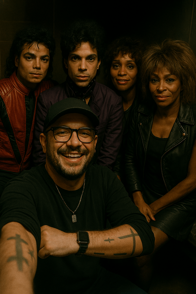
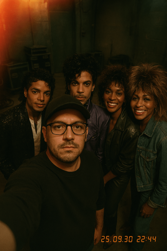
Here are some of my initial attempts:
Why it works: constraints create character
Here is the pattern I keep seeing, whether you are styling an image or governing a tenant:
- Pick a tiny room. Constrain the environment. Specificity narrows the model’s decision tree and improves coherence.
- Name the light. “Cinematic” is a vibe. “Warm bulb plus hallway spill” is physics.
- Set the lens. “High-angle selfie” tells the model where the camera lives and how people behave inside the frame.
- Respect time. “Like the 80s” is vague. “Exactly as in the 80s, including hair, wardrobe, and textures” forces real references and better results.
- Ask for artifacts. Grain, distortion, occlusion, and overlap make the scene feel captured instead of composited.
When we improve prompts, we are doing what we already do in Microsoft 365. We name the boundaries so the system stops guessing.
What surprised me, and might surprise you
- Depth and occlusion changed everything. Shoulders overlapped. Arms cut across jackets. The “paper doll” look disappeared, and the scene felt captured, not arranged.
- Micro-textures like denim weave, leather shine, and stage dust did heavy lifting for realism. If your render looks too clean, ask for surface detail with era-accurate wear.
- The high camera angle did more than flatter. It unified the group. The legends still felt larger than life while the selfie stayed honest.
Try this if your first output misses
- Too plastic? Add: “natural skin texture, visible pores, soft specular highlights, no airbrush.”
- Too bright or flat? Add: “motivated light sources, deeper contrast, preserve shadow detail, no crushed blacks.”
- Too staged? Add: “loose posture, mid-laugh, micro-expressions, slight motion blur at the edges.”
- Too modern? Add: “period-correct wardrobe materials like satin, leather, and sequins, analog film grain, 80s concert color science.”
- Weird hands? Reframe to reduce hands near the lens, or specify: “hand partially cropped at frame edge, fingers naturally curved.”
Iterate in short one-line changes rather than long essays. Fix one thing at a time.
The M365 parallel, because backstage feels like your tenant
Backstage is honest. It is scuffed, loud, and alive. Your tenant often feels the same after a few years of ad hoc Teams, quick SharePoint sites, and heroic Power Apps.
- Lighting equals governance. Give people clear sources such as naming, templates, and DLP. The shadows behave.
- Lens equals use cases. Choose your angle, for example, comms hub, project spaces, or knowledge center, and commit to it.
- Artifacts equal culture. A little grit is good. Lived-in pages, real language, and a conversational tone beat sterile content every time.
Great outputs do not come from “Do everything.” They come from “Do this exactly.”
Accessibility and attribution
This image is an AI-generated tribute that uses the likeness of four cultural icons. It is not a real photograph. If you post it, include alt text like:
Alt: An AI-generated image of a high-angle vertical selfie in a dim, cluttered backstage room. Diego holds the camera, smiling with Michael Jackson, Prince, Whitney Houston, and Tina Turner, each styled as in the 1980s. Warm bulb lighting, soft haze, authentic film grain, layered shoulders and jackets with natural overlap.
Be respectful. We stand on the shoulders of giants. Treat likeness as borrowed light.
Wrap it up
Remember this: The model does not make the moment. You do. AI is just the amplifier; you are the signal. When you give it a room with character, a light with purpose, and a frame with intent, you are not just generating pixels. You are telling a story that feels lived-in. That is the difference between “meh””” and magic.
So next time you prompt, do not settle for vague. Go specific. Go bold. Own the vibe. Because swagger is not in the algorithm. It is in the choices you make before you hit “generate.”
P.S. If you try your own “backstage with legends,” tag me. I want to see the grit.
