
If your SharePoint intranet still looks like it was built using clip art and hope, I’ve got good news: you don’t have to start from scratch—or suck. If you’re also like me and have been on this journey from quite some time, you probably heard the dreaded question or a variant of it: “can you make it not look like SharePoint?“
Well, the good news cycle keeps getting better: Microsoft recently introduced a new batch of SharePoint Design Ideas—a gallery of modern, stylish, and (dare I say) inspiring examples of what your site could look like. These aren’t just mockups. They’re built with native components and actually achievable in the modern SharePoint framework.
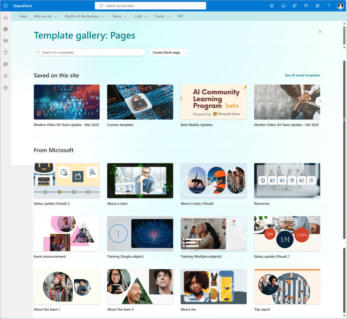
Not sure where to begin? Start by stealing (strategically) from layouts that work. The gallery is organized by use case—department sites, leadership dashboards, internal homepages—and each example highlights how to use sections, web parts, images, and spacing like someone who’s done this before.
Something old, something new, something borrowed, something cool!
Now here is the thing: design ideas aren’t necessarily a brand new thing. It expands upon the design ideas gallery that was introduced with flexible sections. Oh, and guess what? Page templates aren’t a new thing either. What this does however, is expands even further on the templates idea, bringing you loads of new pages that you can start adding to your site right away.
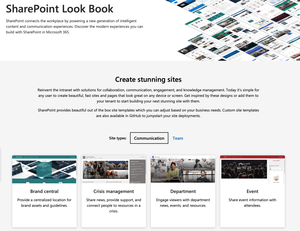
And if you want even more visual ideas and working site templates, don’t sleep on the SharePoint Look Book. It’s been around a while, but it’s still one of the best ways to explore full-page examples that you can not only view—but deploy directly into your tenant with a click.
Between these two resources, there’s no excuse to keep shipping bland, blocky pages. Whether you’re starting fresh or refreshing a legacy site, you’ve got options. Good ones.
Common problems these examples help fix:
- Pages that are too busy, too sparse, or too grey
- Sites that feel more like a document dump than a destination
- Intranets that still think it’s 2011
I’ll say it again: it’s totally fine to copy a great design—especially if it helps you unsuck your SharePoint intranet and make something your users will actually use. Start with the templates. Add your branding. Then make it shine. Just make sure you check with your corporate branding to ensure the kickass site you built does not violate any of your organizational branding policies.
Speaking of corporate branding, many have already said that this could potentially become a nightmare for different page designs sprawling all over your intranet. I will update this post as the feature is rolled out and we learn more about how to keep that consistent, if possible at all!
And if you’re stuck deciding which layout to start with, just leave a question below or ask the M365 community. Trust me, someone out there has already solved your exact problem—and made it look good doing it.
