
Raise your hand if you’ve ever opened a SharePoint site and thought, “Did someone build this in a panic during a fire drill?” Same here. But things are changing, and Figma is leading the charge.
The updated SharePoint Web UI Kit (v3.0.0) brings variables, reusable components, and clean layout patterns to Figma—finally giving intranet designers a toolkit that doesn’t make you question your career choices.
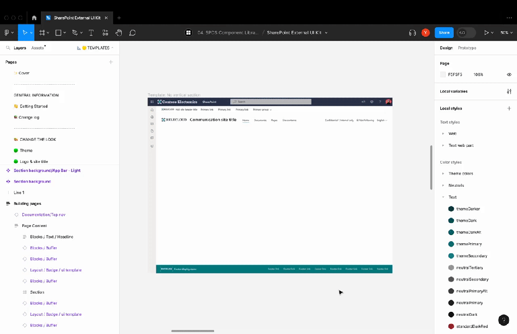
With these updates, you can create wireframes and prototypes that reflect what your SharePoint pages will actually look like. No more guessing how that section will behave. No more developer back-and-forth over column layouts. Just design it, review it, and build it right.
Want to make that hero web part responsive across screen sizes? Now you can prototype it first. Need to show stakeholders what a mega menu would look like before involving devs? You’ve got components for that. This kit bridges the gap between “idea” and “done.”
Want to dive deeper? Check out the video below for a full demo.
I love that Microsoft is finally giving design-first people the attention they deserve. These changes won’t just make pages prettier—they’ll help entire teams align on how modern SharePoint should look and feel.
To everyone in the M365 design community who’s been quietly advocating for this: we see you. And the rest of us are better off because of it.
How about you? Have you leveraged Figma in your SharePoint projects yet? Let me know in the comments.
 Unsuck Microsoft365